Wit of the Staircase (Steele Roberts, 2009)
I still love this cover although I remember seeing it for the first time in print and thinking how grey it looked, my expectations having grown so huge I imagined my first published book would glow with an indefinable aura of absolute pride; sparkle with a sense of accomplishment. The cover image is a shadow of a tūī on a branch gently spotlit with pale floral wallpaper behind.
Tear Water Tea (Steele Roberts, 2013)
This one was painstakingly hand-drawn by David Peters and captures some of the images from the collection. The stubby pencil is a nod to the title reference – a story about all the sad little things that make Owl cry. Read it to your kids. The tradition of my name in serif caps begins here and I love the pale blue. This cover has been described as very feminine which seems fair and appropriate even if intended as a slight.
Lonesome When You Go (Mākaro Press, 2016)
A deviation from poetry and a deviation from my serify name. This cover was also designed by David Peters, initially as a little place holder as I eagerly promoted my novel but then commissioned by Mākaro Press. I love the amp and the title so much but my ego now wants my name in a larger font. The white background has been criticised as being a bit stark for the lively content but it’s intriguing, don’t you think?
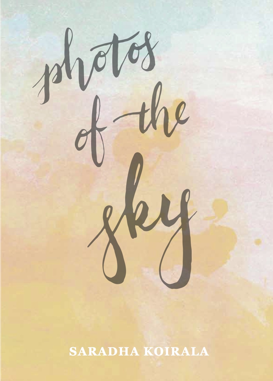
Photos of the Sky (The Cuba Press, 2017)
This beautiful cover was hand-painted by Sarah Bolland of The Cuba Press after much pestering from me. I’m lucky to have had so much creative input into my covers given my inability to articulate my aesthetic desires. I changed the title of the collection a few times too which I’m sure is a publisher’s dream. The title is so beautifully scribed here which I think captures the floaty, heart-on-sleeve nature of the work inside.
Learning to love Blue (Record Press, 2021)
This is the one cover I would probably change and actually could given that it was my idea in the first place. The blue-scale is a nod to the album Blue by Joni Mitchell and the single object floating in space a link to its predecessor Lonesome When You Go, although it has been said that they don’t really look like a pair. I would crank up the font size on the title, but in real life it actually looks quite good. It has a soft matte finish which makes it nice to hold.
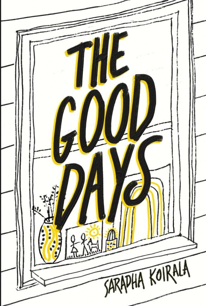
The Good Days (Both Sides Books, 2025)
100% my favourite cover. Designed and drawn by my talented husband with reference to our kids and lockdown days. The yellow is as yellow as yellow can be and the inside cover is too.
Just as my poetry reflects the time and self at each stage, so too do the covers as they become bolder and more sure of themselves, their booky arms open wide.
Stay tuned for my next post: The Profile Pictures!


